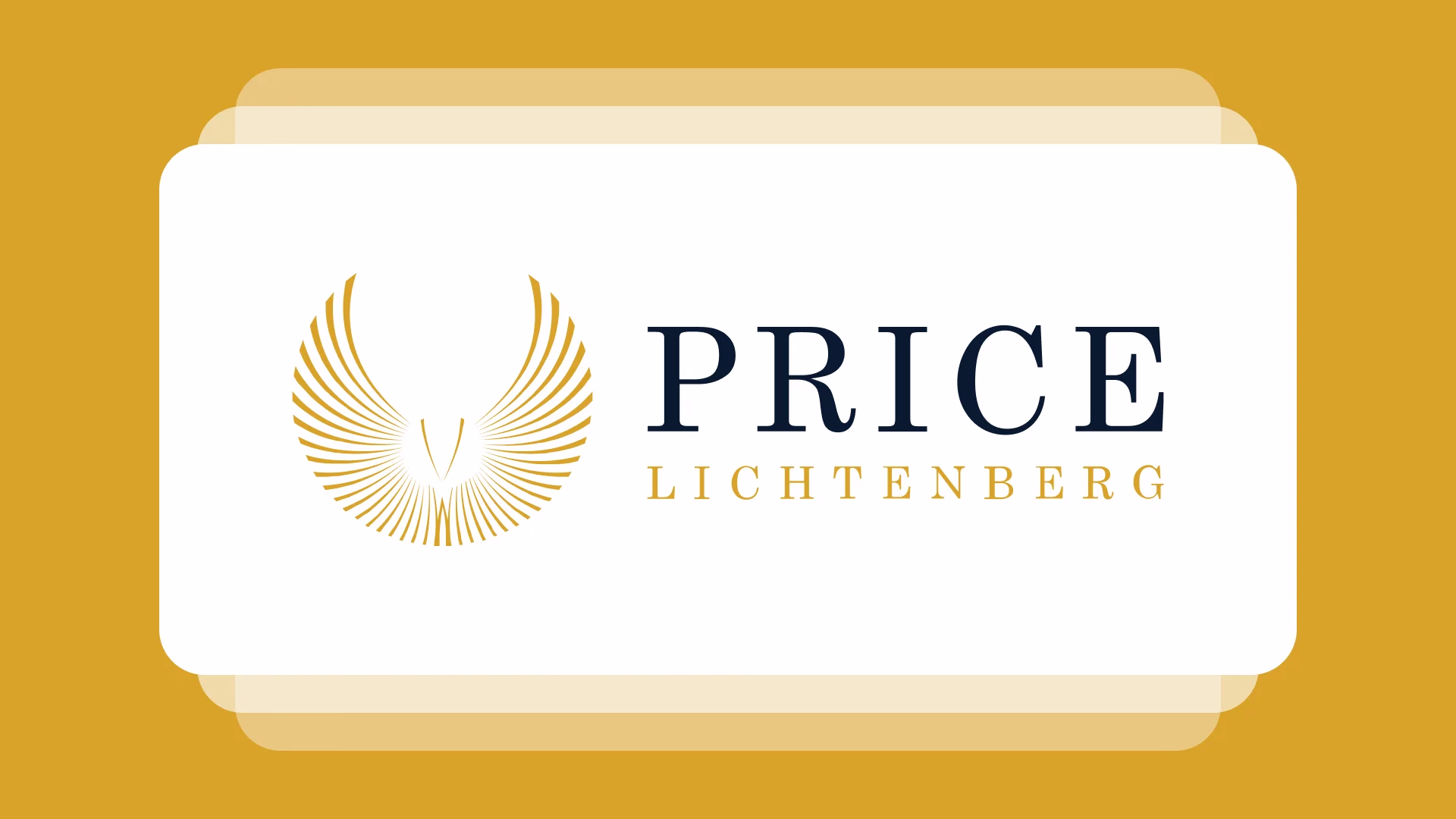
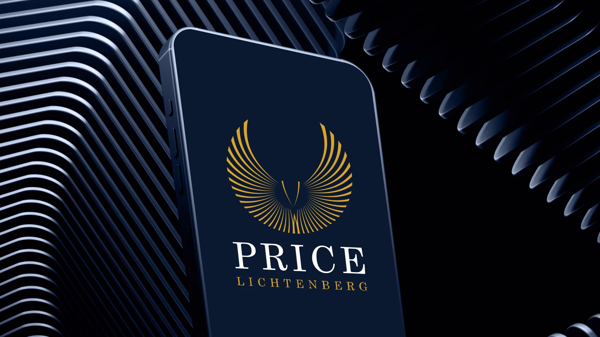
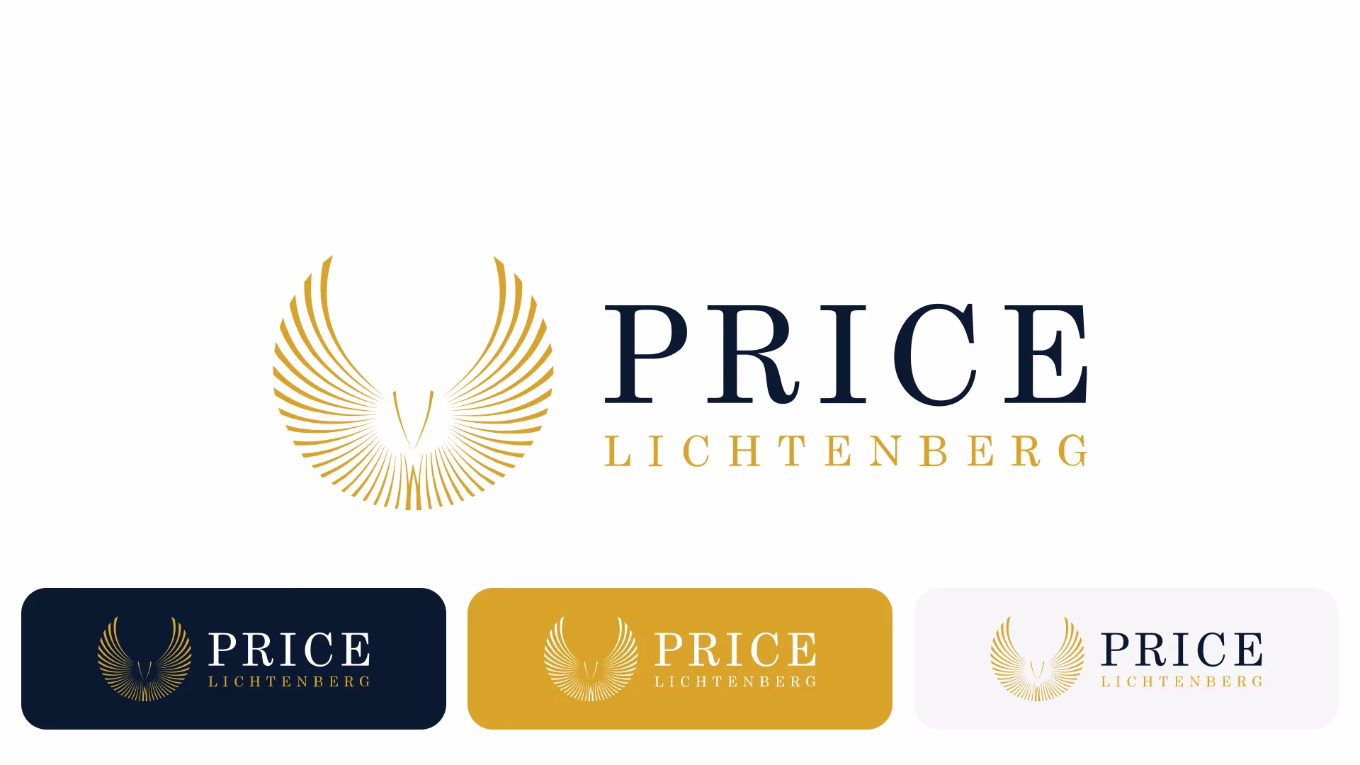
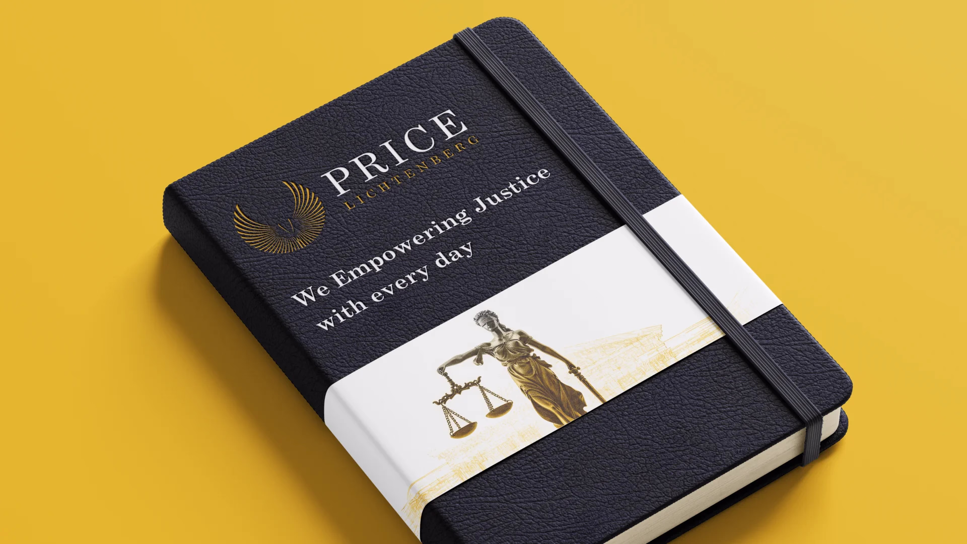
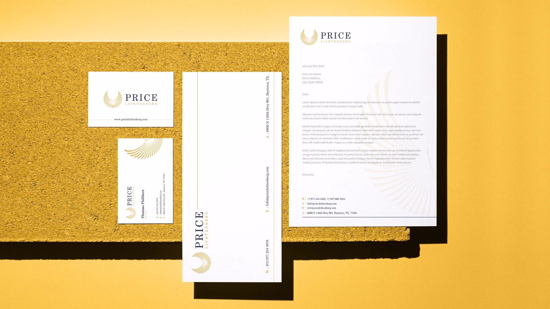
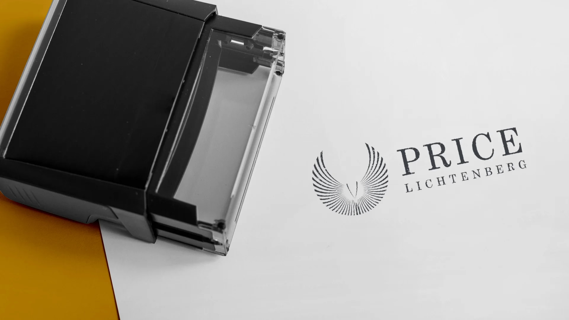
Price Lichtenberg
Welcome to Point2Point, your new way to navigate the city. Just like you're used to, but tailored for a seamless tablet experience. Review driver profiles, vehicle details, and ratings before you confirm your ride. Your safety and comfort are our top priorities. securely pay for your ride with multiple payment options. Rate your driver and help us improve your Point2Point experience.
Client
Technology
Photoshop
Expertise
Web Development
Visual Design
Year


Challenges & Outcomes
A primary challenge was to create a logo that feels both modern and timeless for a law firm. We had to avoid common legal clichés like gavels and scales while still conveying authority and trust. Another key hurdle was ensuring the two names, "Price" and "Lichtenberg," were balanced visually without one overshadowing the other.
The final logo successfully balances tradition with a modern aesthetic, using a classic gold and blue palette with a clean typeface. The winged emblem provides a unique, symbolic identity that suggests aspiration and protection, setting the firm apart from competitors. The design effectively communicates professionalism and reliability while being memorable and versatile for a wide range of applications, from letterheads to digital platforms.
Disciplines of Work
The research phase began with an analysis of established law firm logos to understand what visuals convey trust, authority, and professionalism. We deliberately avoided generic symbols like gavels or scales to stand out. Brainstorming sessions focused on concepts that would symbolize justice, protection, and aspiration, leading to the idea of a winged emblem. This element, inspired by classic heraldry, provided a unique visual identity that is both powerful and elegant.
Initial sketching for the Price logo focused on various concepts for the symbolic emblem, exploring different styles for the winged motif and its integration with the firm's name. After selecting the most promising sketch, the design was meticulously recreated in vector software like Adobe Illustrator. This digital execution allowed for precise control over the clean lines, proportions, and the gold and blue color palette, ensuring the final logo is sharp, scalable, and professional for both print and digital applications.
The Price law firm's style guide ensures a consistent and professional brand presence. It outlines the specific use of the two primary colors: a deep, authoritative blue and a sophisticated, metallic gold, along with their precise hex codes. The guide also details the approved typography, specifying the elegant serif fonts to be used for all firm communications. It provides clear rules on the logo's minimum size, required clear space, and approved variations, ensuring its integrity across all branding materials from business cards to the firm's website.
The Price law firm's branding is built on a foundation of trust, authority, and elegance. The logo, with its strong typography and symbolic winged emblem, serves as a powerful visual representation of these values. The consistent use of the sophisticated gold and blue color palette across all materials reinforces the firm’s commitment to professionalism and excellence, establishing a distinguished identity that resonates with clients seeking high-caliber legal services.
Easy on the Eyes,
Effortless in Action
The logo for the Price law firm uses a sophisticated color palette of deep blue and classic gold to immediately convey trust and prestige. The authoritative deep blue communicates reliability and professionalism, while the gold adds a sense of excellence and timelessness.
This combination stands out from the typical black and white legal branding. The use of a clean, elegant sans-serif font ensures the names are easily readable and adds to the modern, yet serious, feel of the firm, creating a visual identity that is both memorable and trustworthy.
The Dynamic Lichtenberg Identity
The Price Lichtenberg brand identity is built on a foundation of trust, authority, and timeless sophistication. The logo's central element, a striking winged emblem, serves as a powerful symbol of aspiration, protection, and the ability to rise above challenges.
Paired with a deep blue that signifies reliability and a gold that speaks to prestige, the brand's visual language is both strong and elegant. This dynamic identity is more than just a logo; it's a promise of high-caliber legal services and an unwavering commitment to client success.
Feedback From Our Clients
CEO, EcoTech Retail Solutions
"Uni has been instrumental in transforming our e-commerce platform. They didn't just redesign our website, they reimagined it. The customizer they created for our product has been a game-changer, offering our customers a level of personalization we didn't think was possible. Plus, the internal functions they set up have made our operations smoother than ever. We're thrilled with the results and would recommend Uni to any business."