Hecto
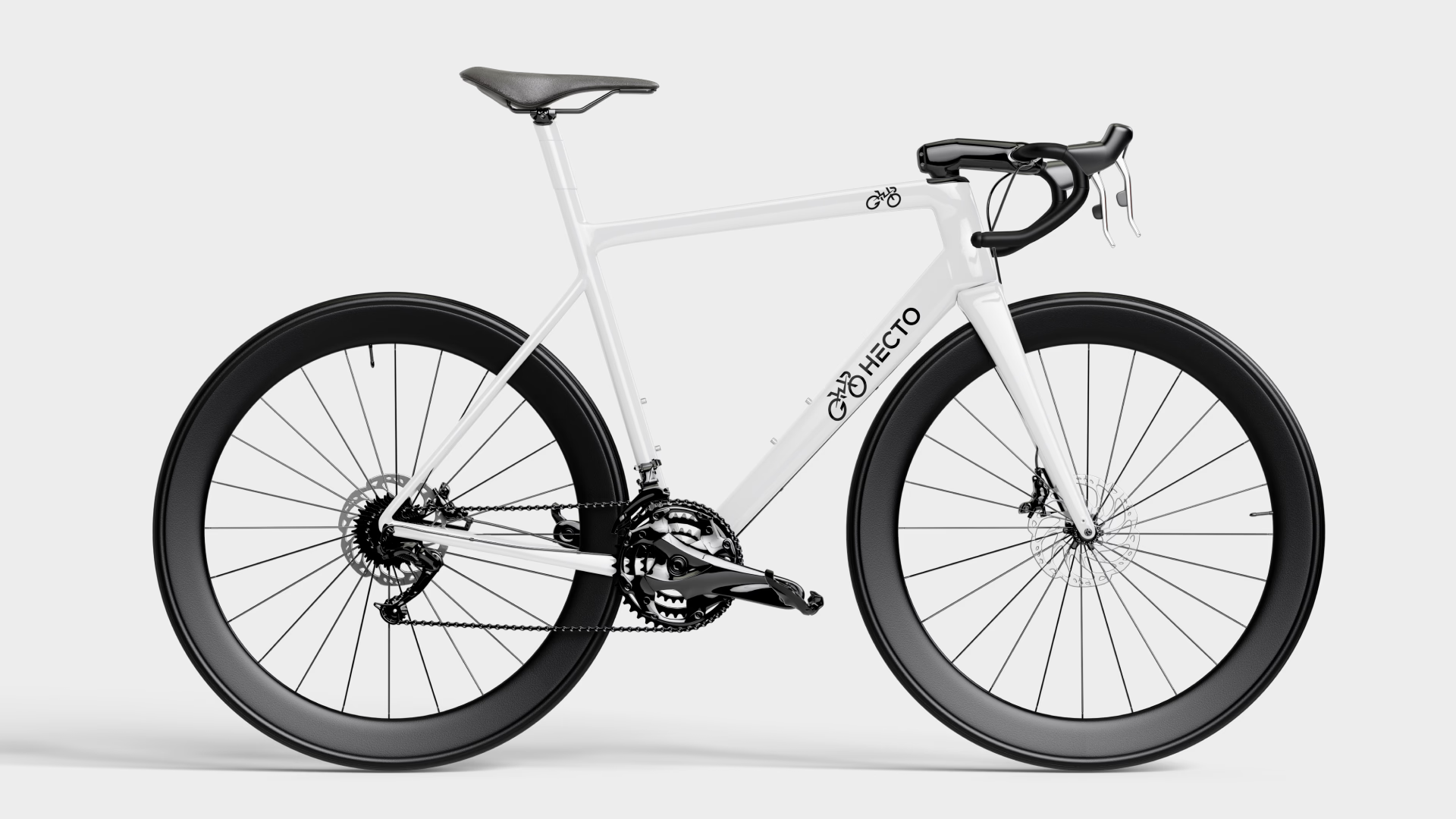
A modern electric cycle logo design crafted with a minimalist and geometric visual identity. Focused on EV branding, sustainable mobility, and innovative design solutions. Built to strengthen brand recognition for electric vehicle startups and eco-friendly businesses.
Client
Technology
Photoshop
Expertise
Brand Guidelines
Year

Challenges & Outcomes
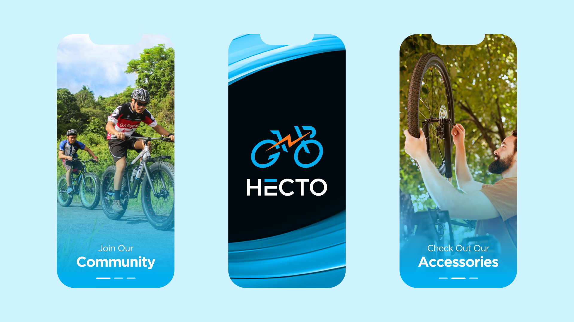
Designing a distinctive electric bike logo design required combining clean energy concepts, motion, and futuristic technology into a single impactful visual identity. The challenge was to avoid overused EV symbols while still communicating speed, sustainability, and electric innovation. The Hashkrio Tech Design Team focused on creating a scalable and minimal design that works seamlessly across digital platforms, mobile apps, and product branding.
The final outcome is a professional EV brand identity design that is clean, versatile, and highly recognizable. The logo performs effectively across websites, packaging, vehicle graphics, and marketing materials, helping the brand stand out in the competitive electric vehicle and e-bike industry while reinforcing eco-conscious and forward-thinking values.

Disciplines of Work
Easy on the Eyes,
Effortless in Action
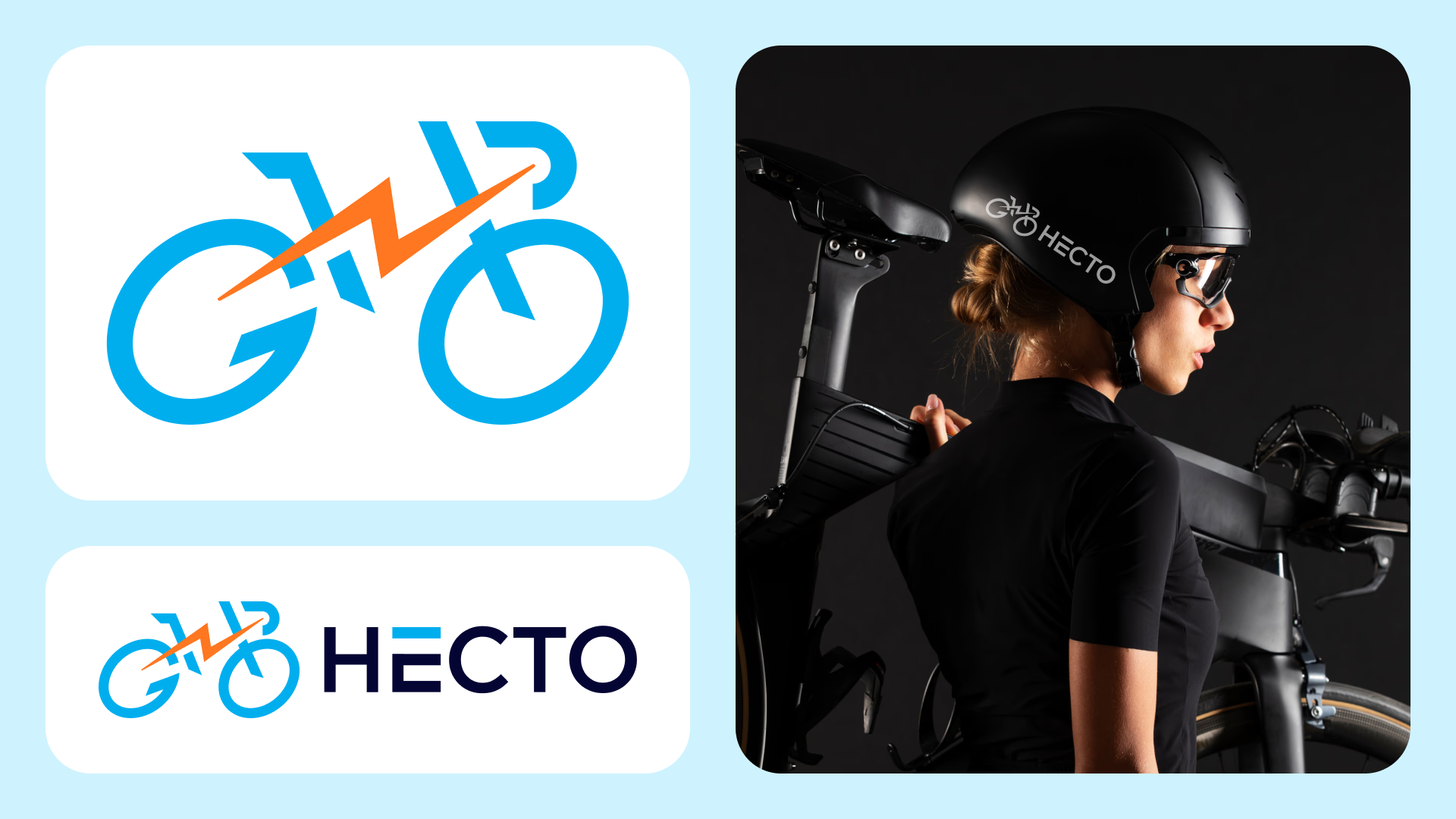
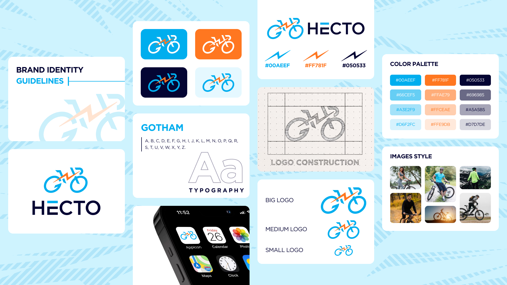
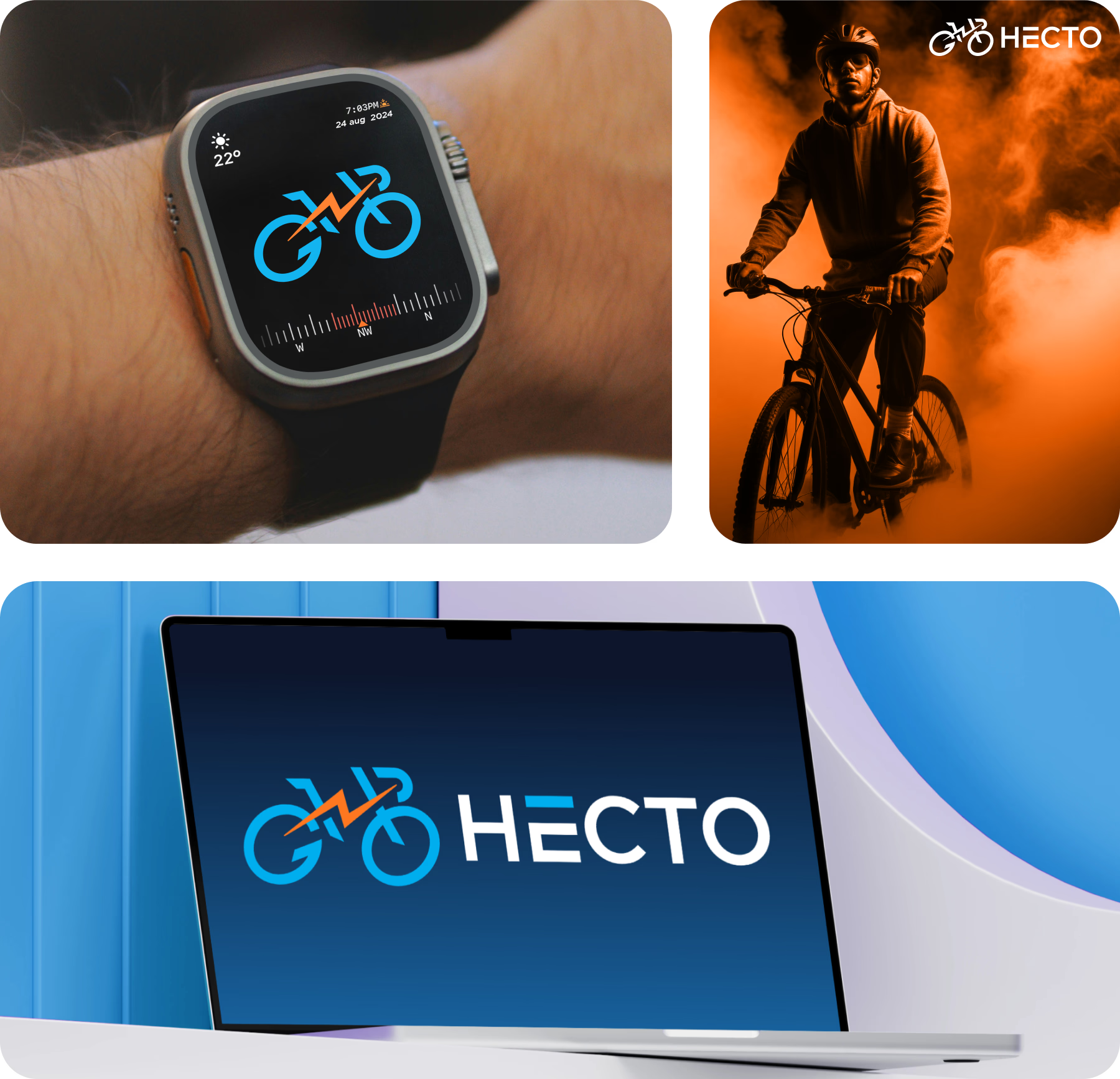
This minimalist electric cycle logo design is built with a clean and structured visual approach that enhances clarity and usability. The refined geometry and balanced composition create a modern EV brand identity that is both visually appealing and highly functional.
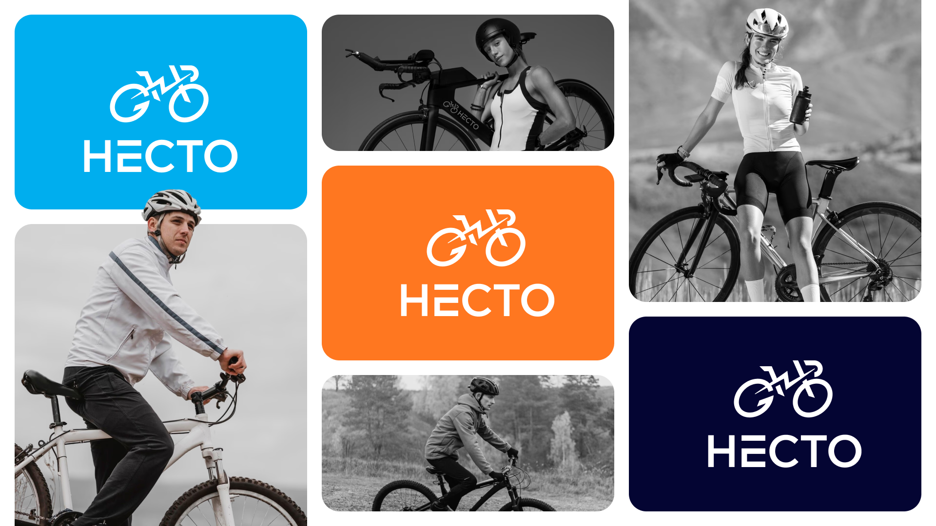
Designed by the Hashkrio Tech Design Team, the logo adapts seamlessly across websites, mobile apps, social media, and product branding, ensuring a consistent and professional presence for electric vehicle brands and eco-friendly startups.
The Dynamic Hecto Identity
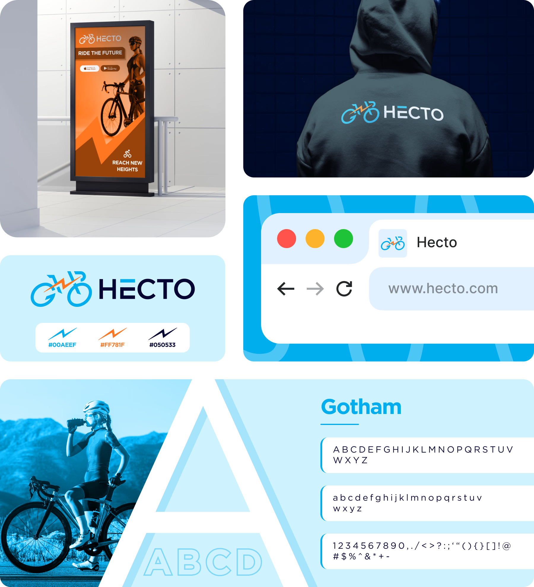
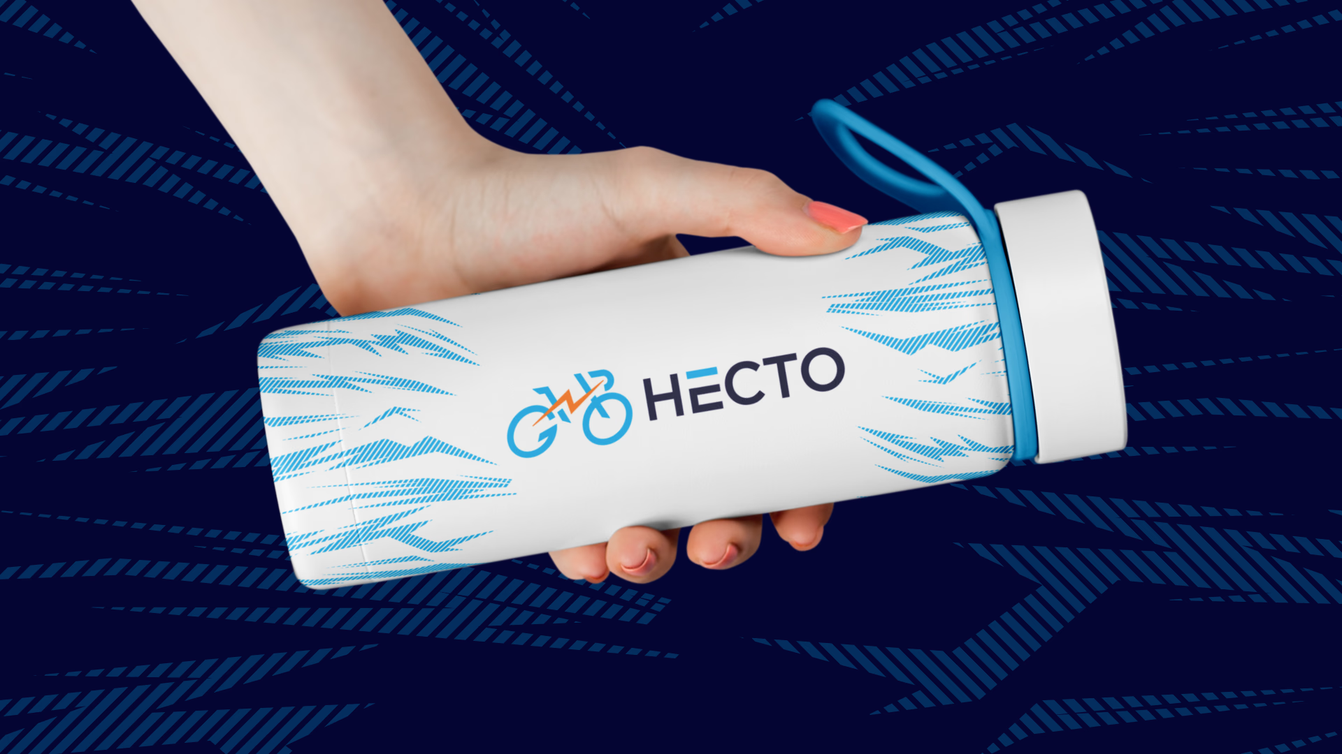
The Hecto electric bike logo identity reflects movement, innovation, and next-generation mobility with a strong visual impact. Its dynamic form and clean geometry represent speed, electric energy, and advanced EV branding solutions.
Built for versatility, the identity performs seamlessly across digital platforms, app interfaces, product packaging, and vehicle graphics, ensuring consistent brand visibility. This scalable and future-ready design positions Hecto as a modern, eco-conscious, and forward-thinking electric vehicle brand in the competitive EV market.
