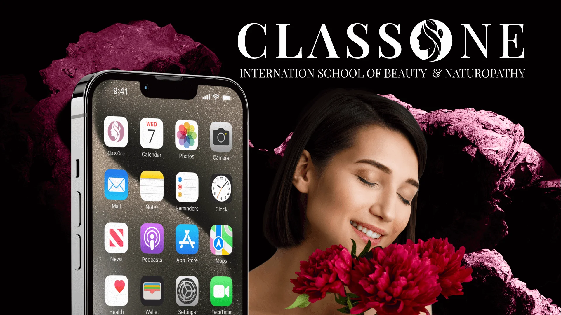
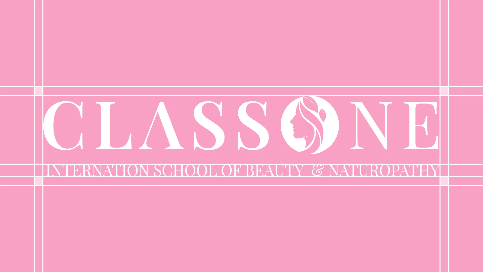
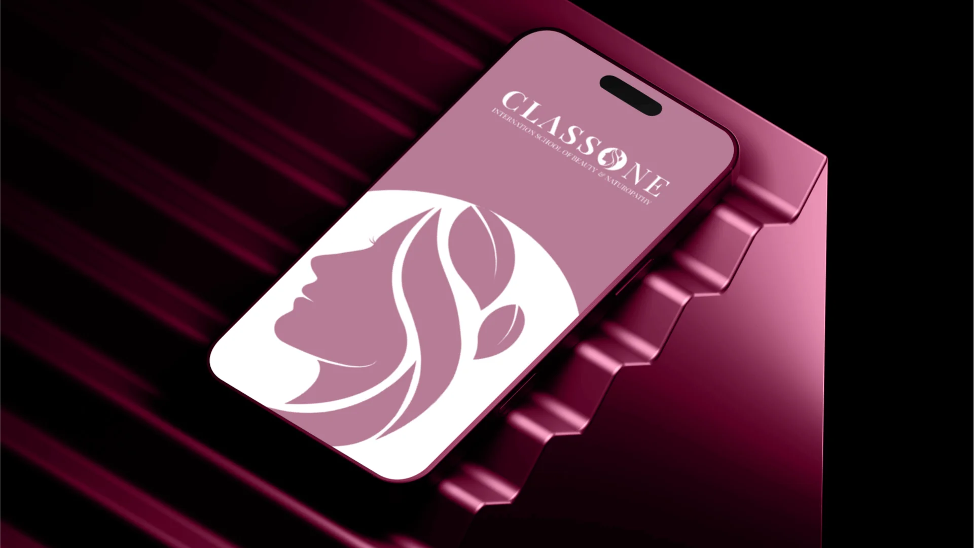
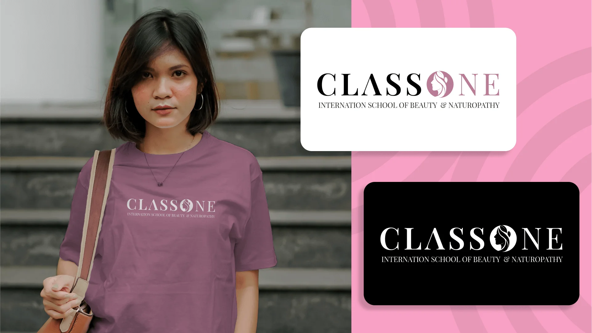
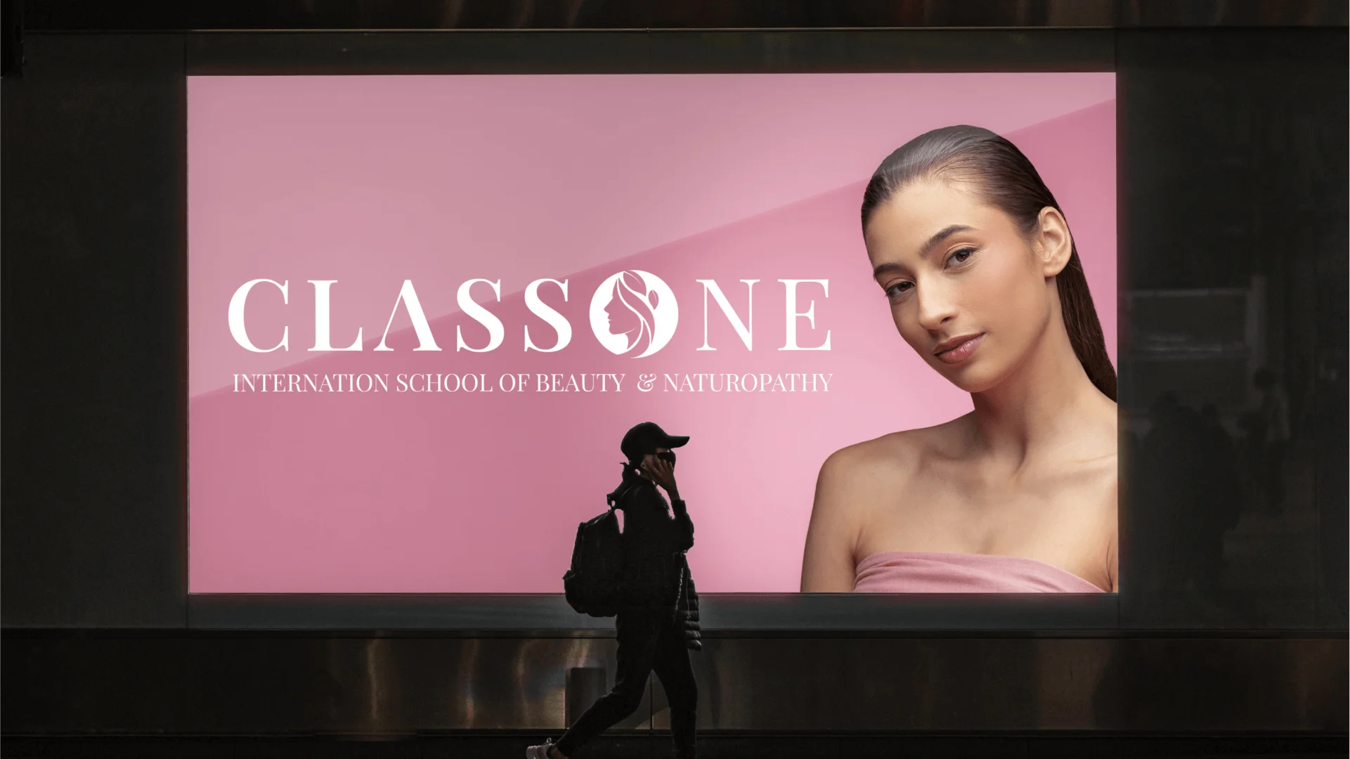
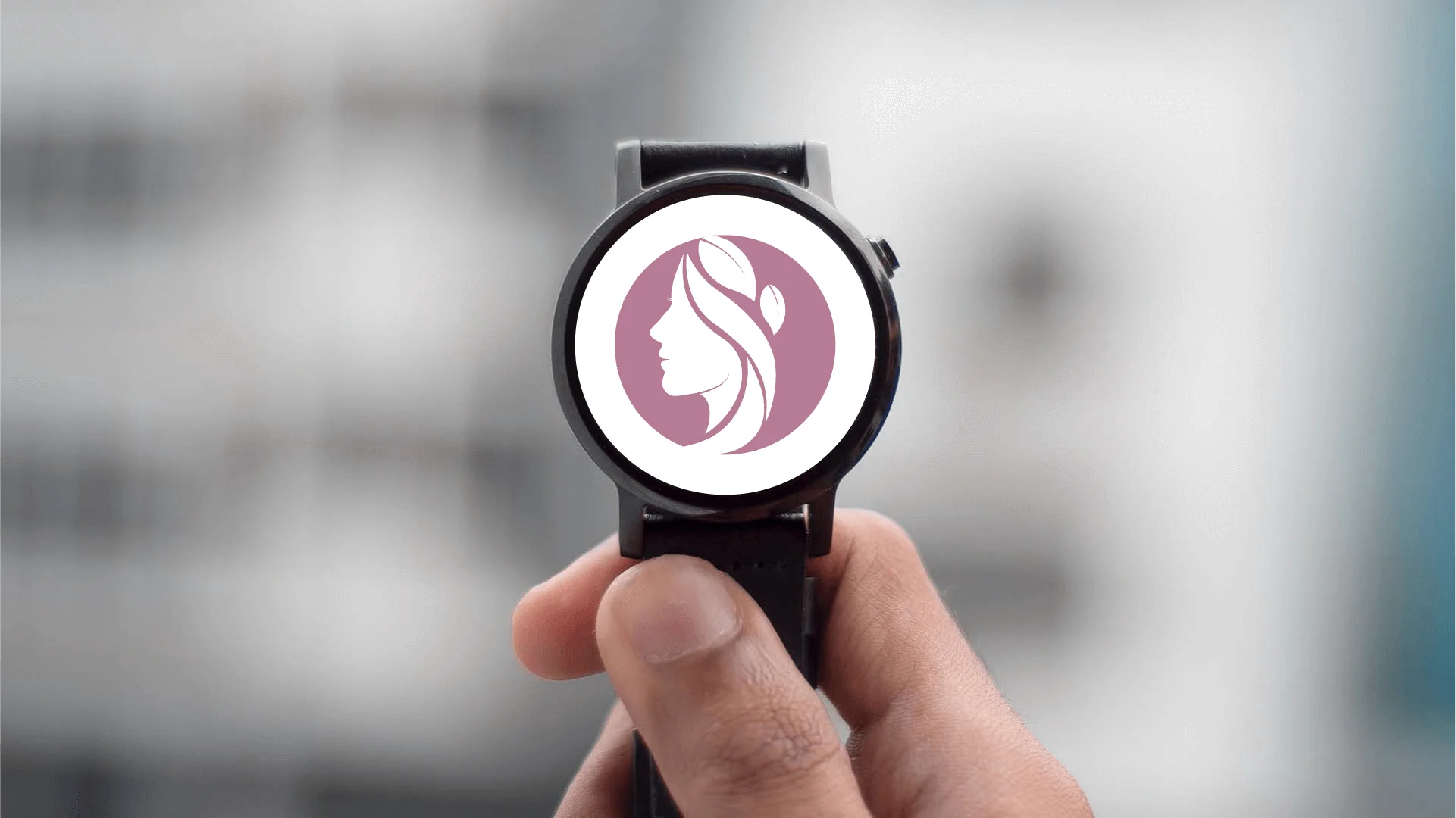
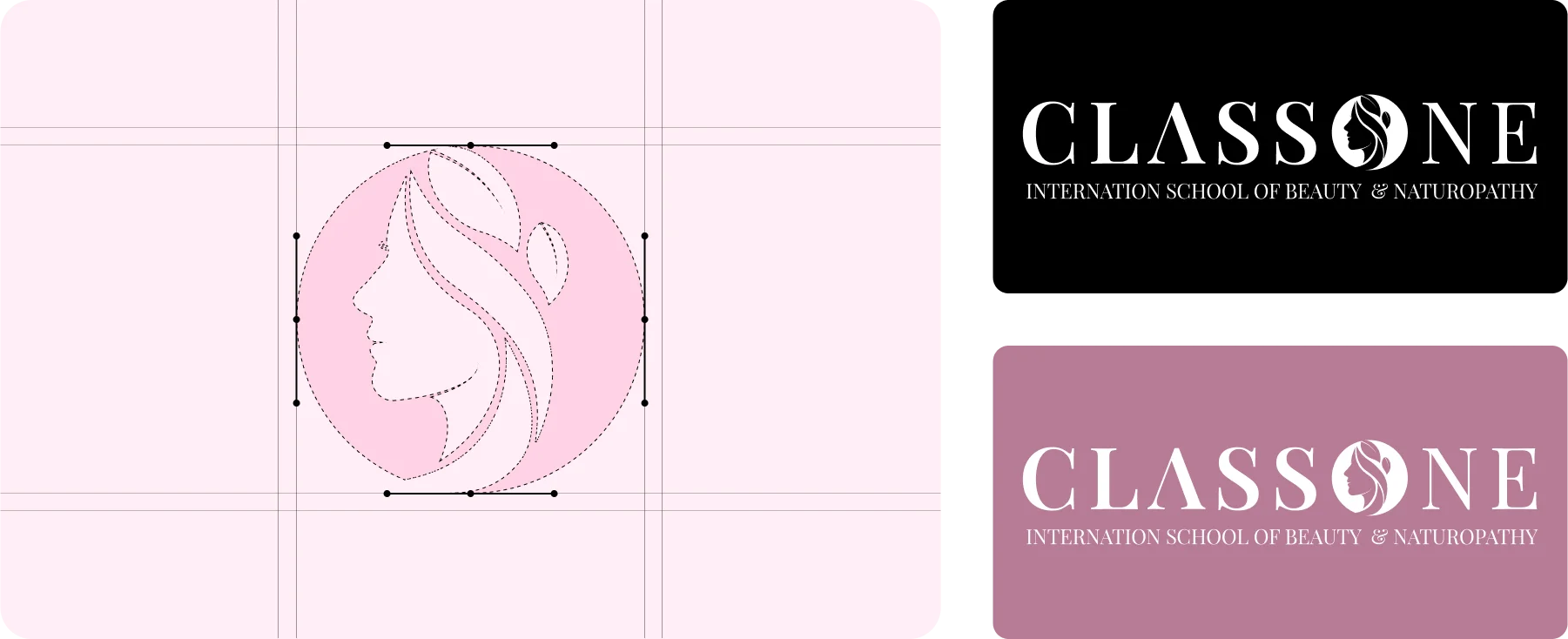
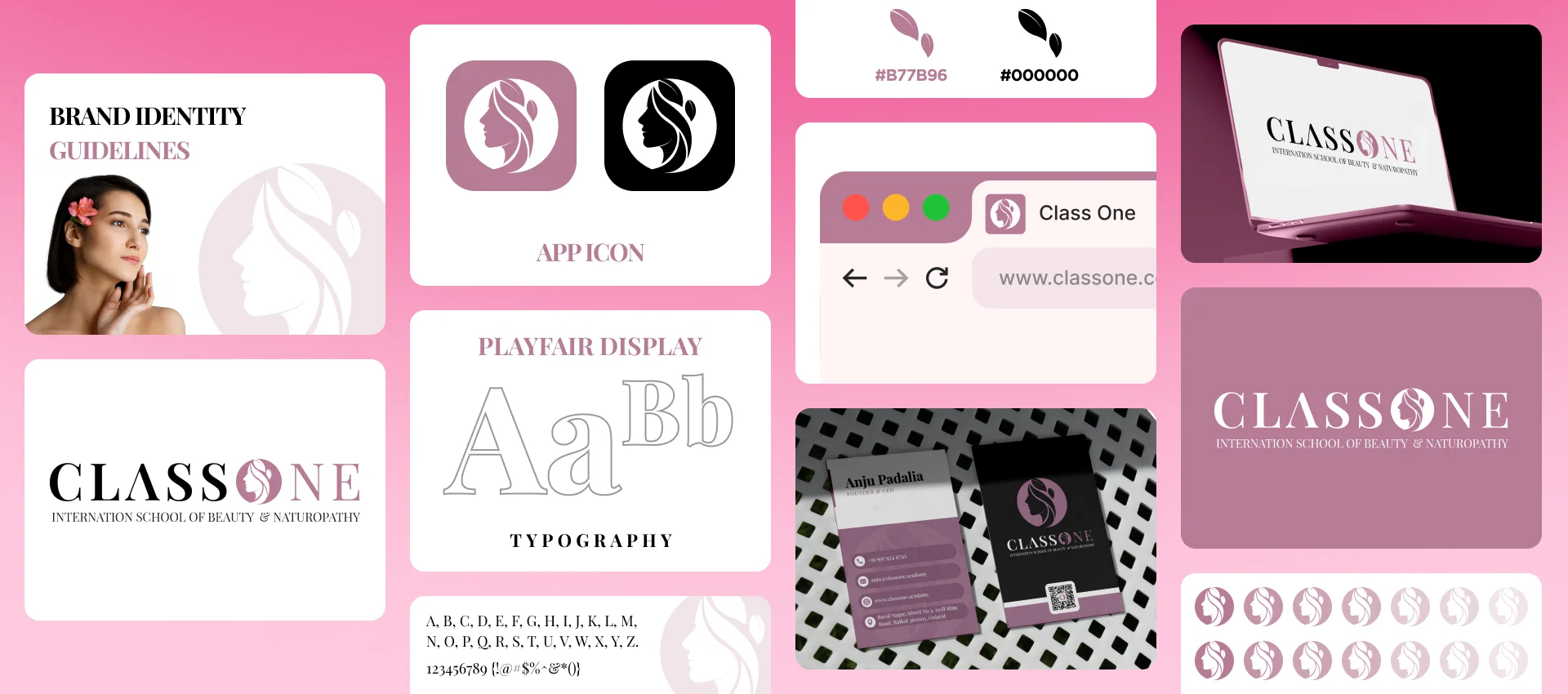
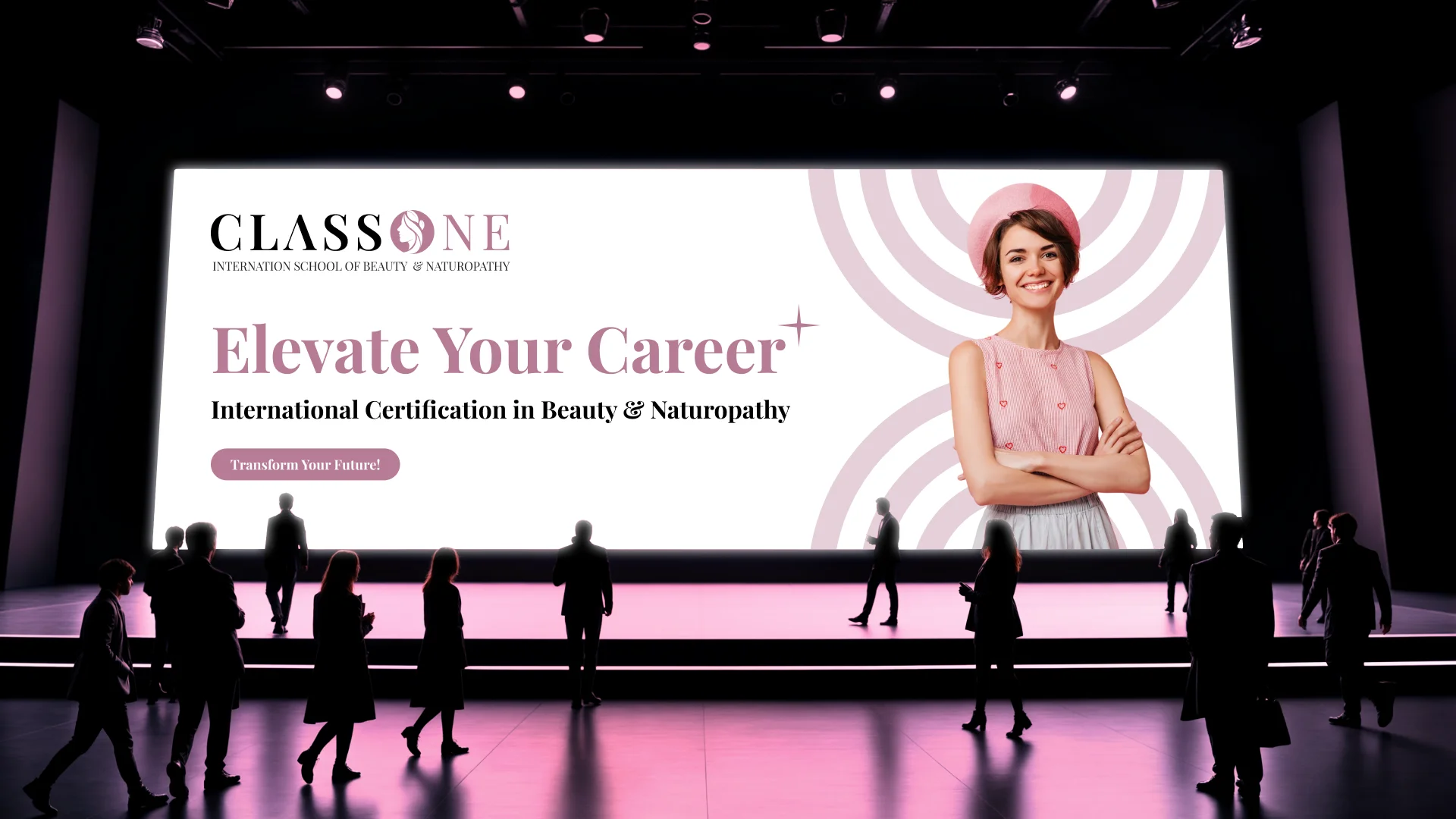
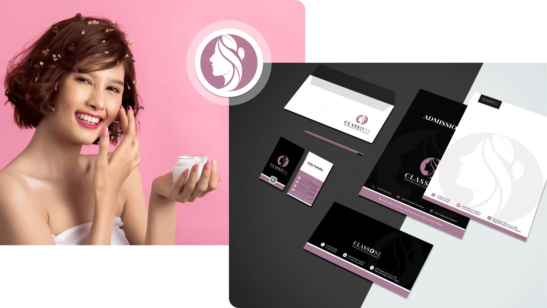
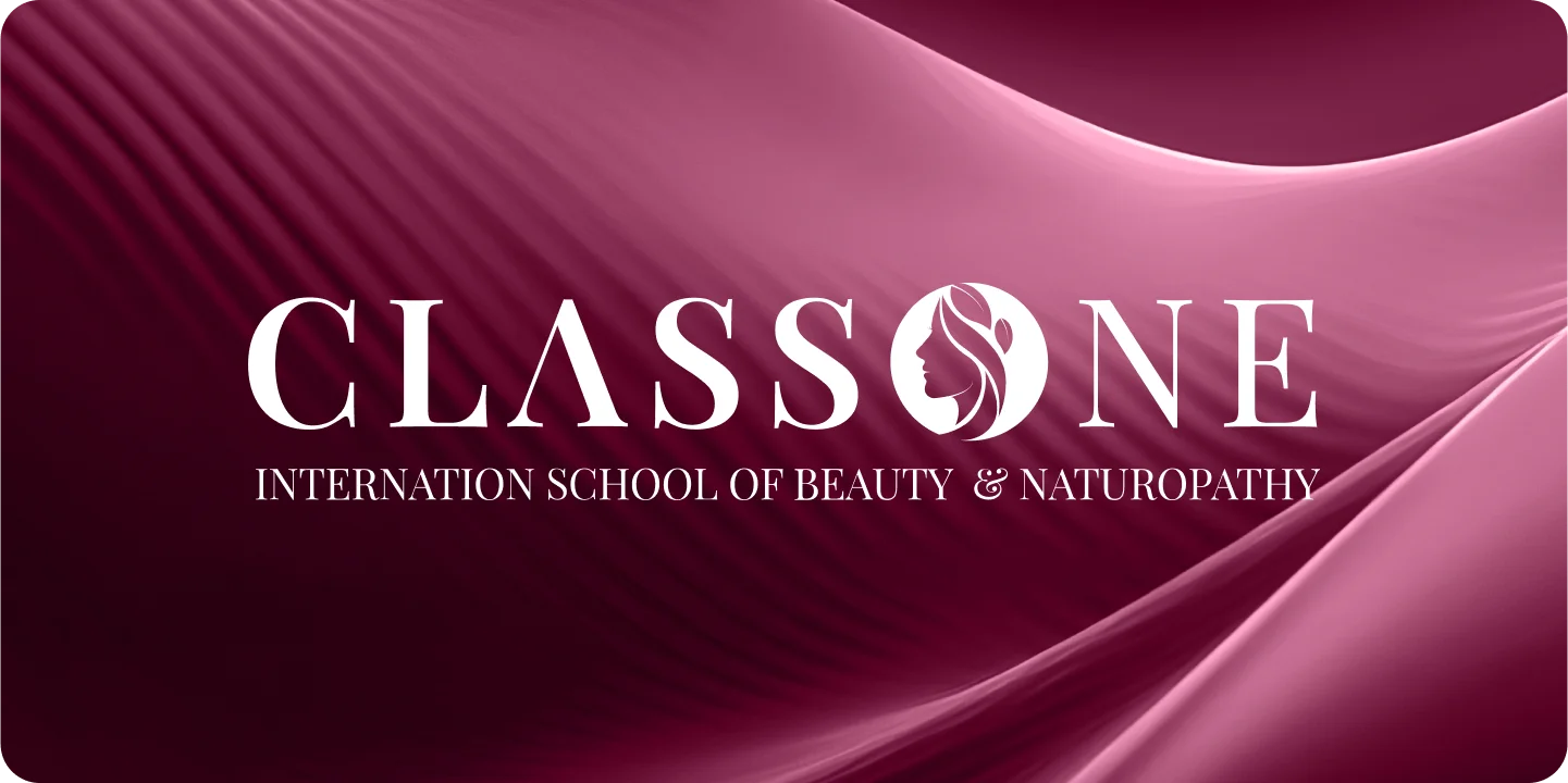
Class One
A premium beauty logo design crafted for modern cosmetics and skincare brand identity. Focused on luxury branding, minimalist logo design, and high-end visual identity systems. Designed to enhance brand recognition, product packaging appeal, and digital brand presence.
Client
Class One

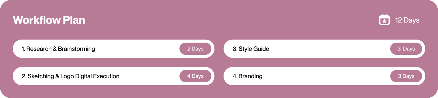
Technology
Illustrator
Photoshop
Photoshop

Expertise
UI/UX Design
Web Development
Visual Design
Web Development
Visual Design
Year
20 March 2024