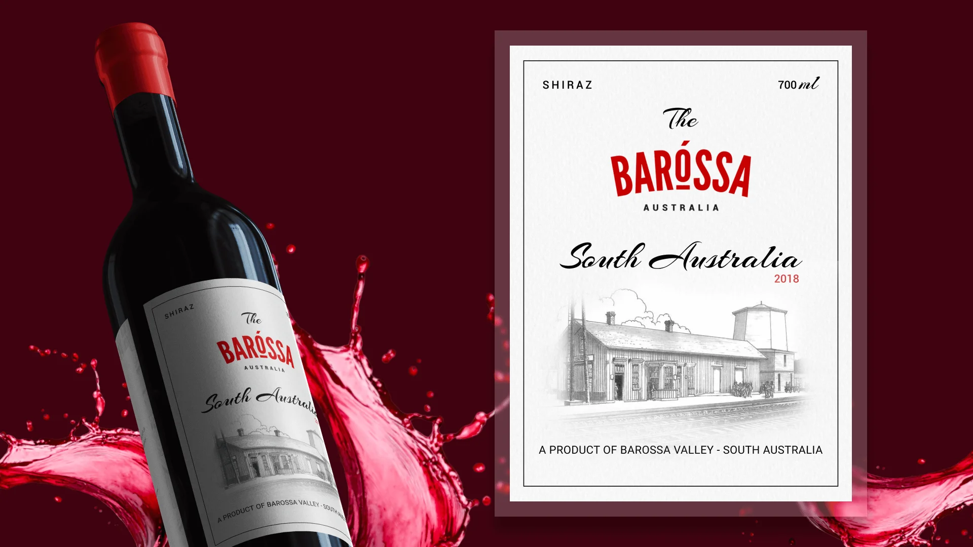
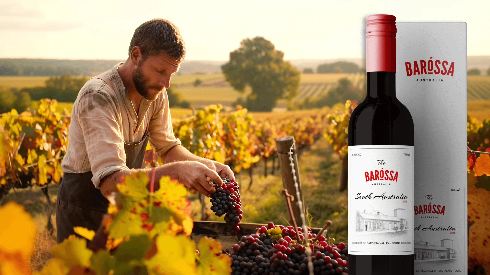
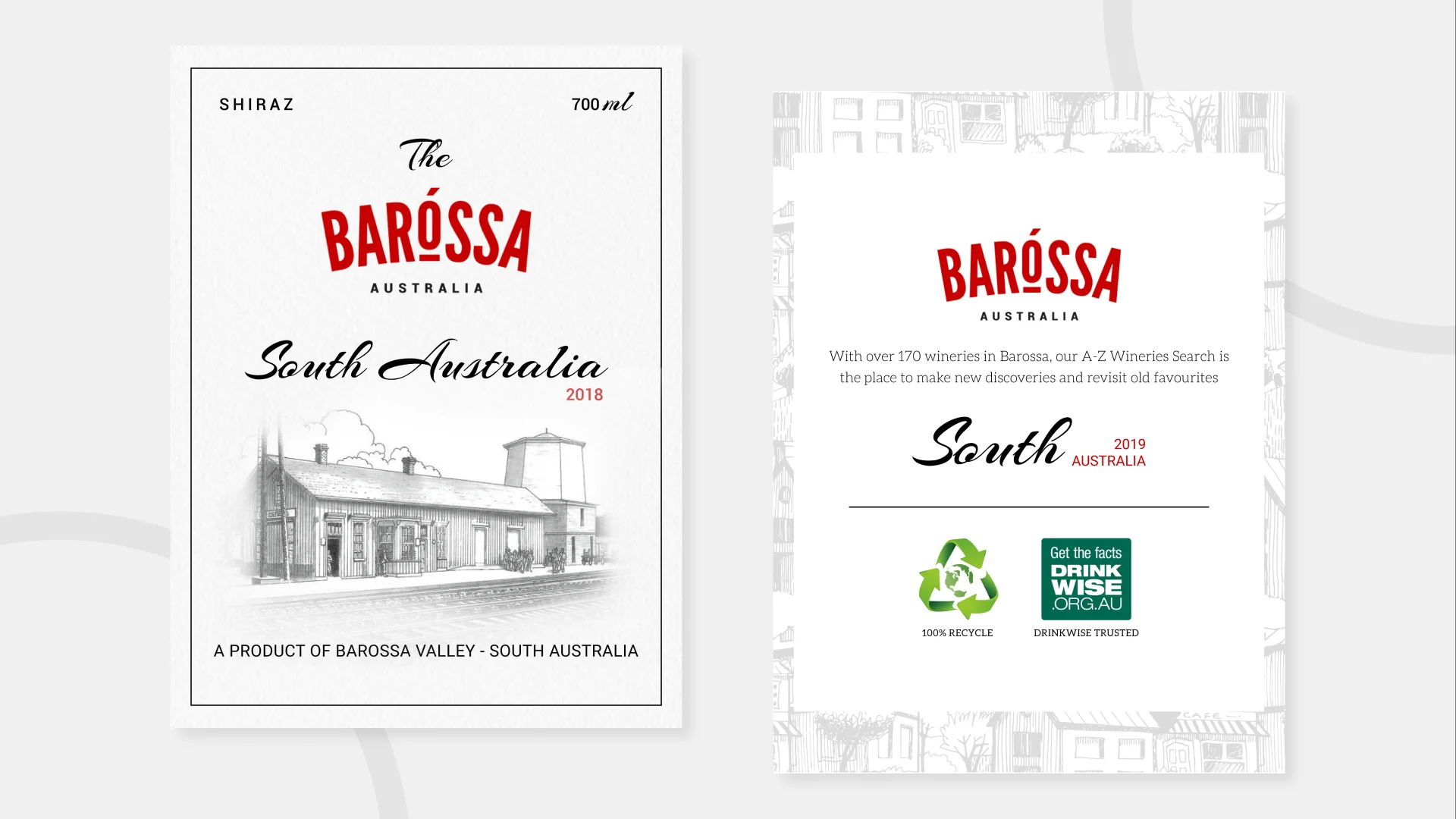
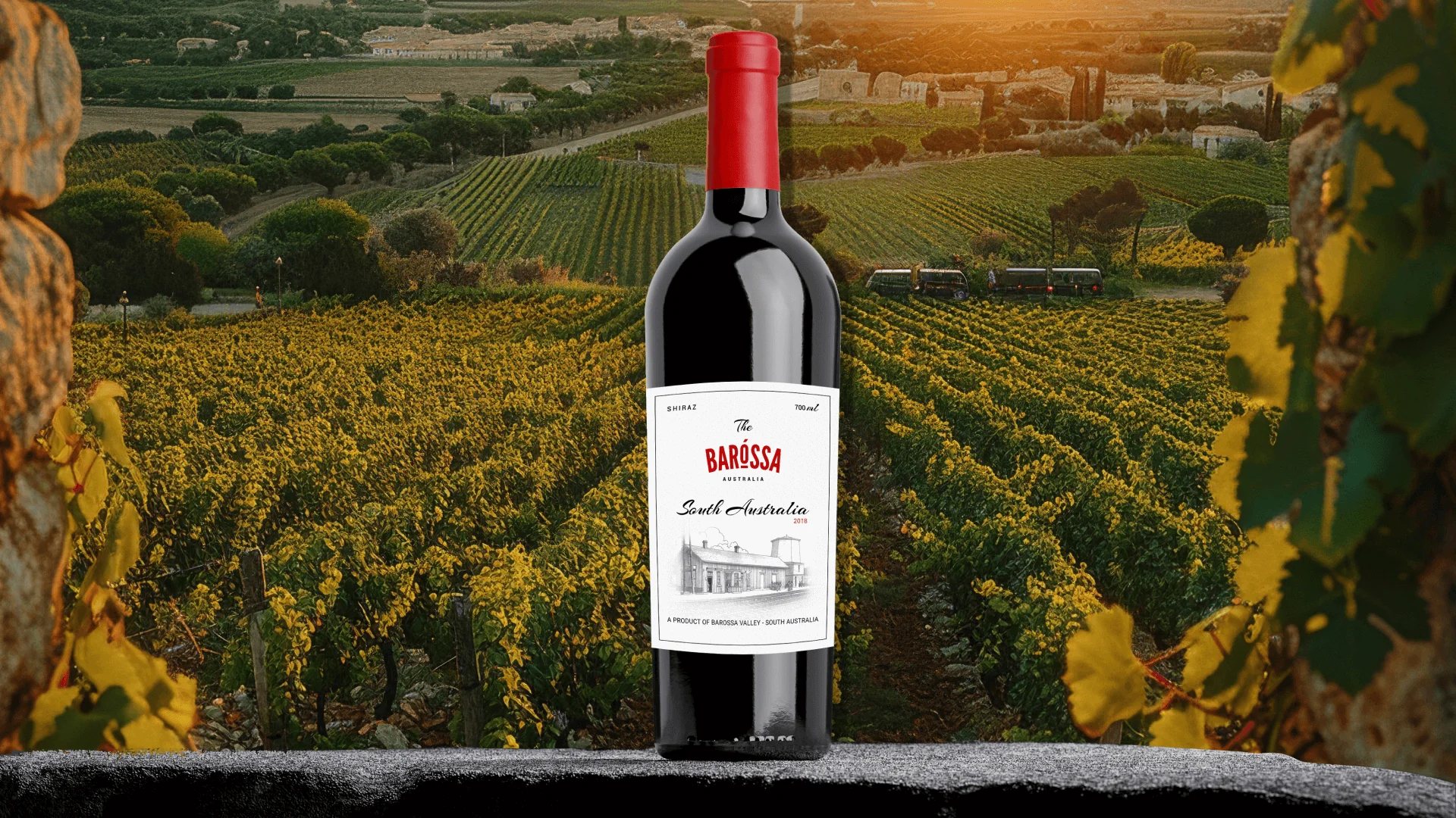
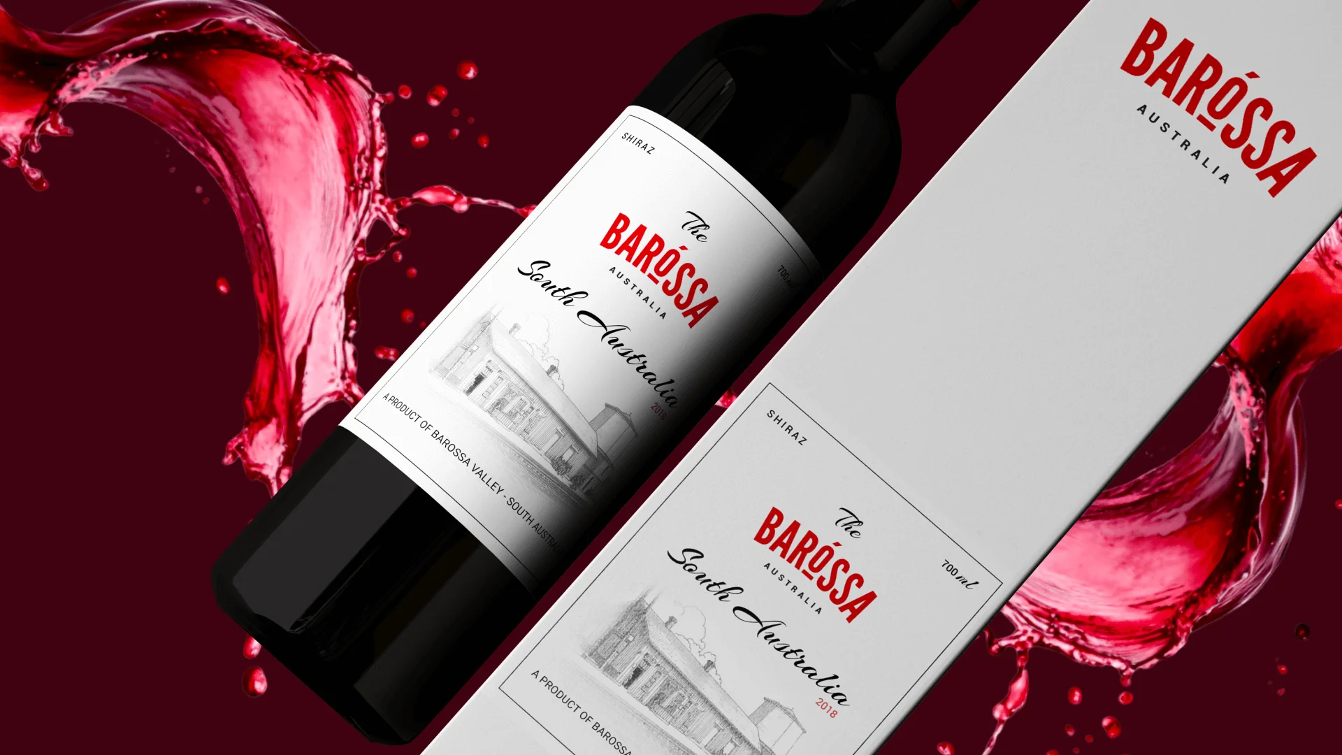
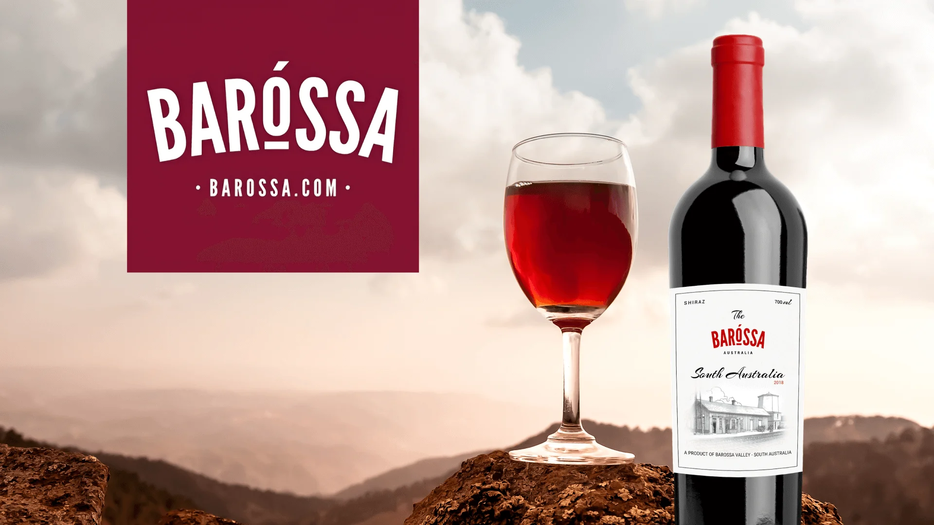
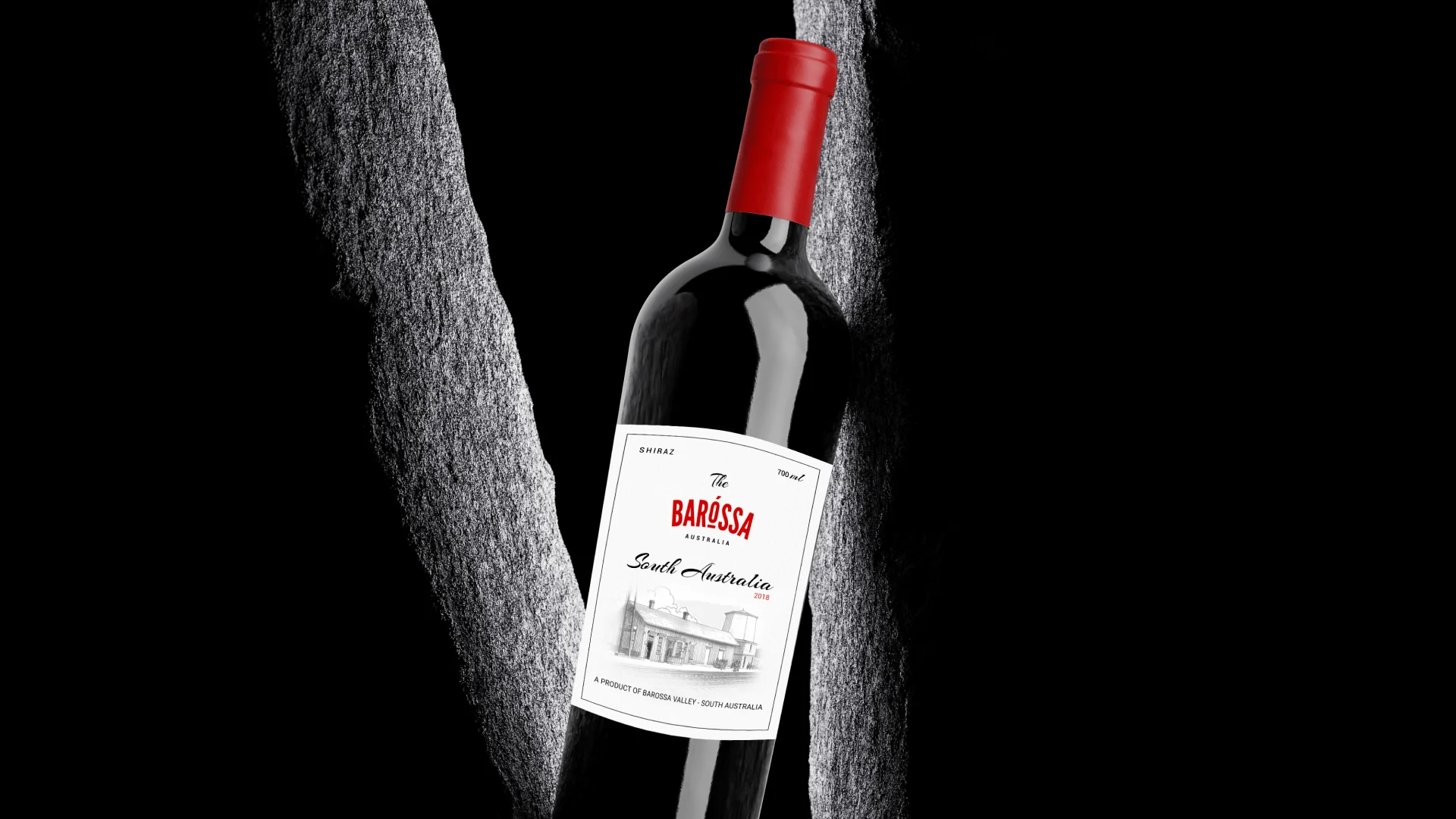
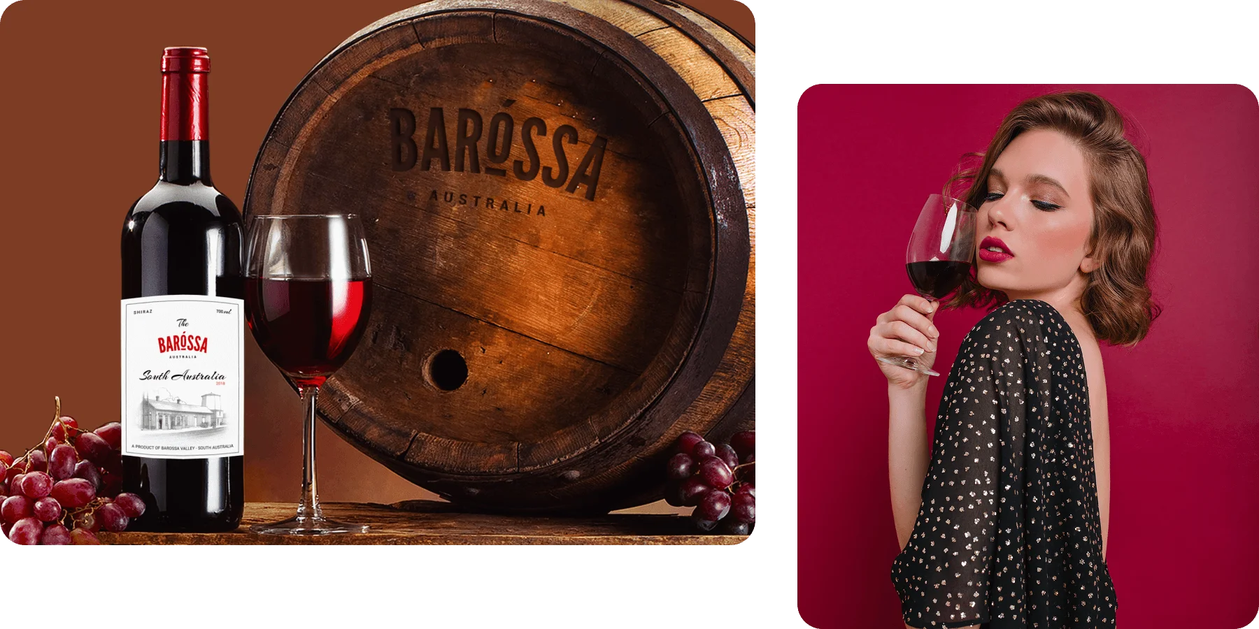
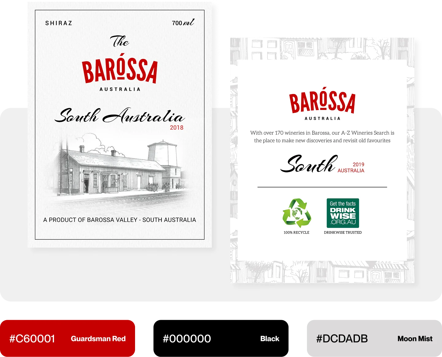
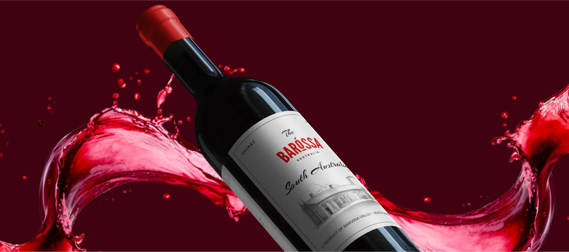
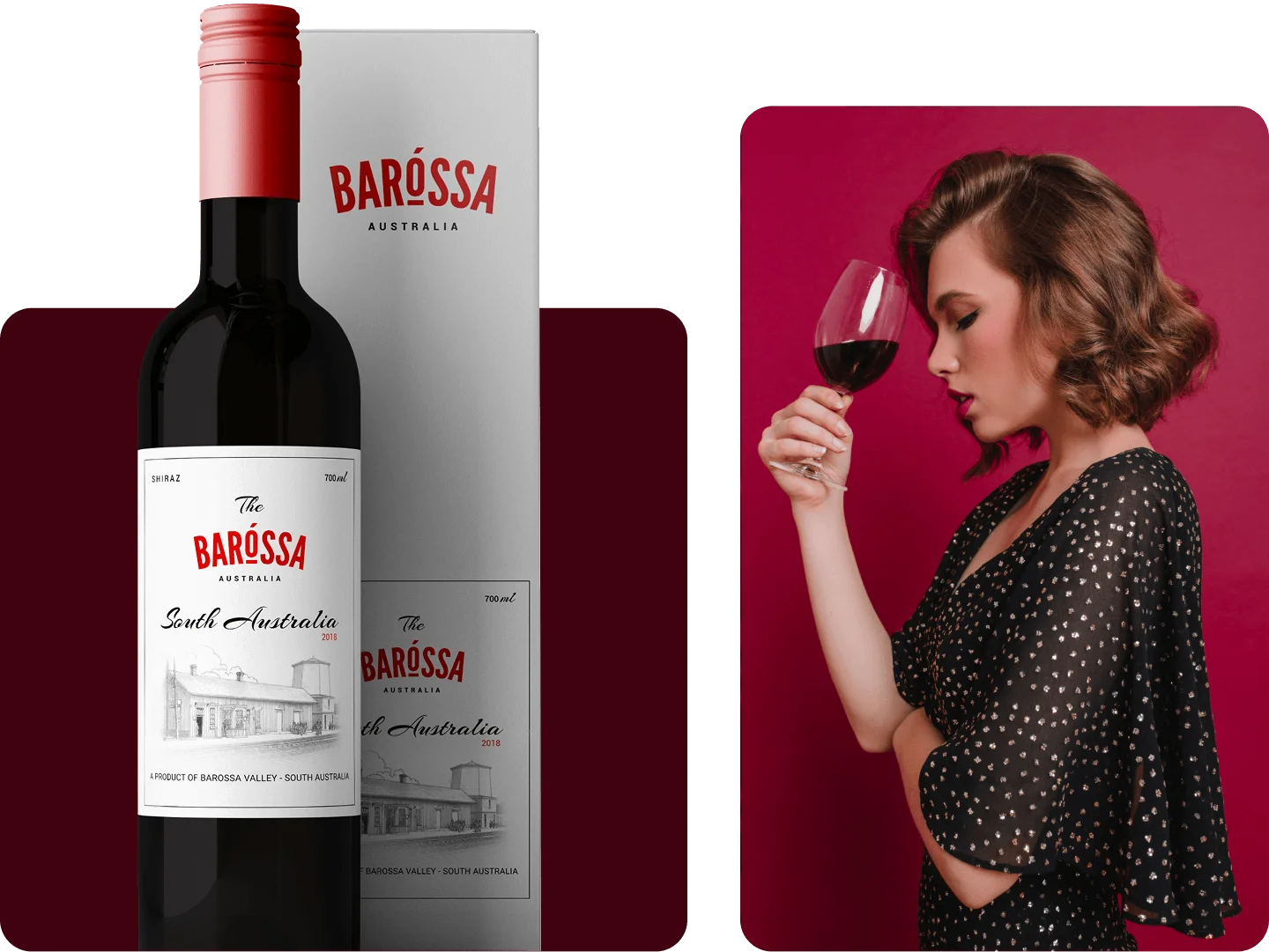
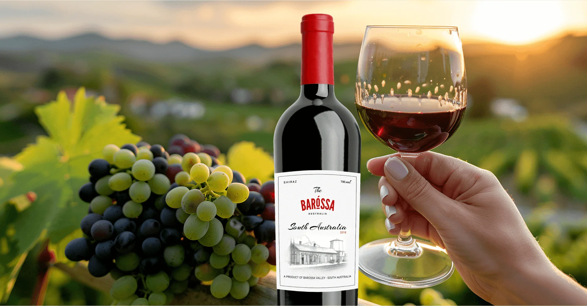
Barossa Wine Label
This project involves designing a wine label for a Shiraz from "The Barossa," specifically highlighting its origins in the Barossa Valley, South Australia. The design incorporates a classic, sketched image of a train station or local building to evoke heritage and place. Key details like the vintage (2018) and volume (700ml) are clearly presented alongside the distinct, bold branding for "BAROSSA."
Client
Technology
Photoshop
Expertise
Web Development
Visual Design
Year


Challenges & Outcomes
The main challenge was integrating bold, modern branding ("The BAROSSA") with a classic, heritage-focused sketch of the station. This required carefully balancing these opposing visual styles to create a premium, yet authentic, presentation while maintaining clear communication of key wine details.
The final design is a cohesive, premium aesthetic that successfully anchors the modern brand to the region's heritage. The clear hierarchy ensures origin (South Australia) and varietal (Shiraz) are prominent, effectively appealing to consumers seeking a quality wine with a strong sense of place.
Disciplines of Work
The Briefing & Concept Development phase for this Barossa Shiraz label centered on establishing a premium, heritage brand identity for "The BAROSSA." The key concept was to merge bold, modern typography with a classic, hand-drawn illustration (the station) to evoke a strong sense of place and regional history. The primary goal was to create a design that is visually distinct on the shelf while clearly communicating the wine's quality.
The Technical Artwork phase involved creating the final press-ready file in CMYK with all text converted to outlines and ensuring precise die-line accuracy for the label shape. The Legal Review confirmed compliance with Australian regulations, verifying the inclusion and correct sizing of mandatory information such as vintage, volume (700ml), Shiraz varietal claims (85%+), alcohol content, and the "Contains Sulfites" statement. This was followed by an external pre-press check for color and foil accuracy before printing.
The Design Execution & Refinement involved meticulously integrating the bold, red "BAROSSA" logotype with the intricate black-and-white sketch, focusing on an optimal visual hierarchy. Refinement centered on adjusting the script font and illustration details to ensure legibility and a balanced aesthetic, leading to the final composition which successfully blends modern brand presence with regional heritage.
The Printing Ready Files were delivered as high-resolution, vector-based Adobe Illustrator/PDF files, including the separate layers for CMYK, embossing, and hot foil stamping. A final checklist and spec sheet confirmed all dimensions, bleeds, die-lines, and the required roll-winding orientation for the Barossa bottling facility's machinery. The files were uploaded to the vendor's secure portal for immediate production.
Easy on the Eyes,
Effortless in Action
We define the brand's unique narrative (e.g., heritage, modernity, vineyard story) to drive the label concept. We select premium materials, finishes (embossing, foil), and colour palettes that visually communicate the Barossa quality and terroir.
Ensure all elements are cohesive, compelling, and instantly convey the wine's positioning and personality on a crowded shelf.
Stay Focused
The brand personality for Class One is defined by Sophistication, Expertise, and Holistic Wellness. This is conveyed through the elegant Dusky Pink Woman Face icon, which speaks to natural beauty and calm.
The use of a strong, professional wordmark establishes the school's authority and commitment to delivering international-standard, expert education in both beauty and naturopathy.
The Dynamic Class One Identity
The Class One identity is dynamic because it successfully marries two distinct industries: the elegance of high-end beauty with the principles of natural naturopathy. logo stylized profile of a woman with the strong clear name.
This is achieved visually through the sophisticated icon and the grounding, professional wordmark. The brand is designed to be flexible and authoritative, allowing it to resonate across diverse international markets while consistently projecting expertise and a commitment to holistic, cutting-edge education.
Feedback From Our Clients
CEO, EcoTech Retail Solutions
"Uni has been instrumental in transforming our e-commerce platform. They didn't just redesign our website, they reimagined it. The customizer they created for our product has been a game-changer, offering our customers a level of personalization we didn't think was possible. Plus, the internal functions they set up have made our operations smoother than ever. We're thrilled with the results and would recommend Uni to any business."