How to Implement Accessibility Best Practices in Figma Workflows
Designing for accessibility in Figma elevates usability, trust, and business outcomes when aligned with WCAG 2.2 and supported by purposeful plugins, structured audits, and clear semantics documented for development and QA teams. Embedding accessibility from tokens to handoff ensures inclusive experiences that scale across devices, languages, and motion preferences.
Why Accessibility in Figma Matters
Accessible design isn’t cosmetic—it’s foundational to completing tasks confidently, reducing friction, and improving quality for everyone when guided by WCAG 2.2 success criteria throughout the workflow. Treating accessibility as a system—foundations, responsive design, prototyping, audits, documentation, and testing—creates repeatable, measurable outcomes.
SEO-Focused Keywords
Use the following naturally in headings and body text: Figma accessibility, WCAG 2.2, contrast checking, focus appearance, keyboard navigation, reduced motion, ARIA labels, Auto Layout accessibility, accessible design system, Figma Stark plugin, color contrast, focus order, tap target size, dark mode accessibility.
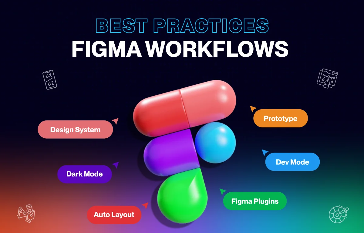
Set Strong Foundations (Design System)
- Define color tokens that meet AA/AAA for text, UI states, and dark mode; document approved text/background pairs and state colors in the library.
- Establish typographic scales readable at 200–400% zoom with line-height and spacing rules that preserve legibility and avoid color-only meaning.
- Build component variants for hover, focus, active, disabled, and error; ensure focus indicators meet WCAG 2.2 guidance for visibility and not being obscured.
- Bake generous target sizes into controls to satisfy WCAG 2.2 hit target guidance for tap/click areas.
Practical Checks to Include
- Validate palette and text/background pairs with contrast tools and record compliant combinations.
- Ensure focus rings are highly visible and distinct per 2.4.13 Focus Appearance guidance.
- Use headings and hierarchy rules to structure reading order and content scanning.
Design Responsively (Layout and States)
- Use Auto Layout and constraints so content reflows without clipping during text scaling and localization expansions.
- Maintain logical layer order that mirrors reading order for assistive tech, ensuring helper and error text never overlaps or truncates.
- Stress-test long labels, multi-line content, and dense UI across breakpoints and densities to uphold legibility and control sizing.
- Provide dark mode tokens and imagery overlays that preserve contrast and focus visibility across themes.
Prototype for Accessibility (Interactions)
- Map keyboard tab order to follow visual hierarchy; verify visible focus on all interactive elements.
- Validate modal behavior: trap focus, support Escape to close, and return focus to the triggering element on exit.
- Offer reduced-motion prototype paths for animated interactions to respect motion sensitivity preferences.
- Avoid hover-only affordances; provide equivalent keyboard interactions and clear focus parity.
Run Plugin Audits (Cadence and Tools)
- Establish an audit cadence during component creation, pre-feature signoff, and pre-handoff to catch issues early and maintain consistency.
- Use Stark and WCAG-focused plugins to check contrast, simulate color vision, map focus order, and annotate alt text and semantics.
- Export plugin results into the Figma file and track findings with checklists/widgets for team visibility and QA traceability.
Suggested Figma Plugins
- Stark for contrast checks, color vision simulations, focus mapping, and annotations.
- WCAG contrast, heading structure, and focus order plugins for frame-level checks.
Document Semantics and Behavior (Dev-Ready)
- Annotate roles, names, and states for controls, including ARIA label/description guidance for icons and non-text UI to ensure programmatic names.
- Specify keyboard behavior, error messaging, and announcement expectations for assistive technologies.
- Attach acceptance criteria that reference WCAG 2.2 checkpoints directly inside component and screen docs for clarity.
Collaborate and Handoff (Shared Definition of Done)
- Share plugin reports and maintain a living accessibility checklist in the file; align on a “Done” standard that includes accessibility criteria.
- Publish system-level audits for reusable components to preserve compliance downstream in consuming products.
- Track changes to tokens and component accessibility properties in library release notes to keep teams synchronized.
Test Beyond Figma (Real Devices, AT)
- Combine automated checks with manual reviews on real devices, including keyboard-only tests and screen reader spot checks.
- Validate journey-level flows (forms, checkout, authentication) to catch inter-step issues that static mockups can miss.
- Translate Figma accessibility notes into developer-ready specs and confirm WCAG conformance in staging before release.
Recommended Stack (Quick Start)
- Core plugin: Stark for contrast, simulations, focus order, and annotations.
- Complementary: WCAG contrast and heading/focus order plugins, color-blind simulators, typography/readability tools.
- Checklists/templates: Designer-focused WCAG 2.2 resources and Figma Community templates to standardize reviews.
Operational Checklist (Copy/Paste into a Word Checklist)
- Foundations: AA/AAA tokens and typographic scale; states and generous target sizes defined.
- Responsive: Auto Layout applied; long-label and large-text stress tests pass; dark mode contrast preserved.
- Prototype: Keyboard flows mapped; focus visible; motion alternatives included; modals trap focus and restore on close.
- Audit: Plugin scans clean; issues tracked with annotations; checklists updated.
- Semantics: Roles/names/states and ARIA documented; error/announcement patterns specified.
- Handoff: Acceptance criteria and reports attached; dev/QA alignment confirmed; library release notes updated.
Conclusion (Impact and Priorities)
Accessibility improvements transform product quality by enabling clear navigation, smooth task completion, and inclusive interactions that build trust and business value under WCAG 2.2. Prioritize high-impact journeys—checkout, forms, core content access, support paths—to deliver measurable wins quickly while reducing friction for everyone.