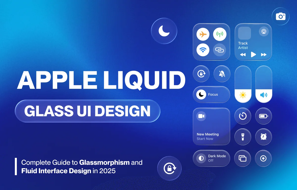
Apple Liquid Glass UI Design: Complete Guide to Glassmorphism and Fluid Interface Design in 2025
Apple’s Liquid Glass UI design has become one of the most influential design trends in modern interface development. This comprehensive guide explores glassmorphism effects, fluid interface design principles, and adaptive UI systems that are reshaping how we interact with digital products.
What is Liquid Glass UI Design?
Liquid Glass UI design combines glassmorphism aesthetics with fluid, adaptive interface principles. It creates semi-transparent layers with frosted glass effects, subtle shadows, and dynamic blur effects that respond to content and context. This design approach goes beyond visual appeal, it serves strategic business objectives while enhancing user experience.
Key Characteristics of Liquid Glass Design
- Transparency and layering: Semi-transparent elements that create depth
- Frosted glass effects: Backdrop blur creating a premium feel
- Fluid animations: Smooth transitions between states
- Adaptive layouts: Context-aware interface adjustments
- Dynamic responsiveness: Real-time adaptation to content and user behavior
Why Companies Invest in UI Redesign
Business Value of Interface Updates
Interface redesign delivers measurable business benefits beyond aesthetic improvement:
- Increased press coverage and social media engagement
- Enhanced brand perception and competitive differentiation
- Marketing opportunities around product “newness”
- Sales lift through heightened user interest
- Customer retention via refreshed user experience
The Psychology of Visual Design Updates
Visual redesigns create the perception of innovation even when core functionality remains unchanged. This psychology-driven strategy maintains brand momentum between major feature releases, generating commercial value through increased purchase intent and user engagement.
Functional vs. Cosmetic Design Changes
Supporting New Hardware Capabilities
Not all redesigns are purely aesthetic. The best interface updates enable expanded capabilities:
Hardware Integration Benefits:
- Support for foldable devices and dynamic screen configurations
- Stylus and pressure-sensitive input compatibility
- Accommodation of new screen formats (notches, dynamic islands)
- Advanced gesture controls and voice command integration
Apple’s iOS 7 Example: Apple’s iOS 7 redesign introduced scalable design principles supporting multiple iPhone screen sizes. This structural transformation enabled consistent experiences across device dimensions while maintaining visual coherence.
Evaluating Design System Updates
When assessing interface redesigns, consider:
- Hardware Integration: Does the redesign enable new device features or input methods?
- Information Architecture: Do visual changes improve content hierarchy and navigation?
- Accessibility Enhancement: Are accessibility features and customization options improved?
- Development Efficiency: Does the design system reduce development friction across platforms?
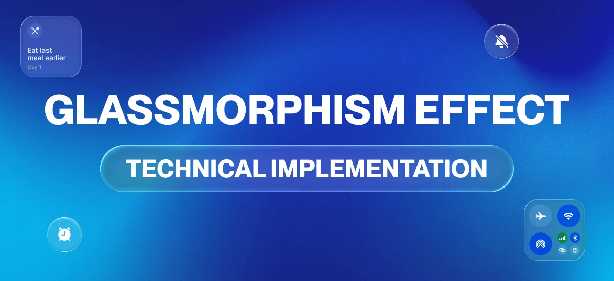
Glassmorphism Effect: Technical Implementation
Understanding Glassmorphism Design
Glassmorphism creates the illusion of frosted glass through:
- Backdrop filters: CSS backdrop-blur for frosted effects
- Layered transparency: Multiple semi-transparent surfaces
- Subtle borders: Light borders enhancing glass edges
- Shadow depth: Soft shadows creating elevation
- Color tinting: Slight color overlays for brand integration
Best Practices for Glassmorphism
Do’s:
- Use subtle transparency (10-30% opacity)
- Maintain adequate contrast for readability
- Apply consistent blur values throughout
- Test accessibility with various backgrounds
- Combine with solid backgrounds when needed
Don’ts:
- Overuse transparency causing readability issues
- Apply heavy blur that impacts performance
- Ignore color contrast accessibility standards
- Use glassmorphism for critical UI elements without fallbacks
Fluid Interface Design Principles
What Makes Interfaces Fluid?
Fluid interface design seamlessly adapts to multiple contexts:
- Content type variations: Different layouts for text, images, video
- User behavior patterns: Adaptive based on interaction history
- Device orientation changes: Smooth transitions between portrait and landscape
- Environmental factors: Brightness, location, time of day
Modern Fluid Design Characteristics
Automatic Content Prioritization: Interfaces that understand user context and prioritize relevant information
Dynamic Element Sizing: Components that resize responsively based on available screen real estate
Intelligent Whitespace Management: Automatic spacing adjustments for optimal readability
Context-Sensitive Density: Information density that adapts to user needs and device capabilities
Adaptive UI Design with AI Integration
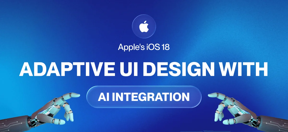
Apple’s iOS 18 Intelligent Design
Apple’s iOS 18 introduces AI-powered adaptive design features:
Wallpaper-Responsive Design: Clock sizing automatically adjusts based on wallpaper imagery to preserve visually important background elements
Notification-Aware Layouts: Interface elements dynamically reposition based on incoming notifications
Context-Aware Customization: Personalized experiences without manual configuration requirements
Future of AI-Powered Interfaces
Emerging AI Design Capabilities:
- Predictive layout adjustments based on user behavior
- Automatic color scheme optimization for readability
- Intelligent content summarization and prioritization
- Dynamic accessibility adjustments for individual needs
Brand Differentiation Through Design Language
Creating Competitive Visual Identity
Interface innovation establishes distinct brand signatures when competitor products converge visually. Strategic design language creates recognizable patterns that influence purchase decisions.
Benefits of Strong Design Systems:
- Coherent experiences across devices and applications
- Reduced learning friction for users
- Increased user confidence navigating brand ecosystem
- Stronger user loyalty through consistent visual experiences
Building Design Language Consistency
- Define core visual principles aligned with brand identity
- Create reusable component libraries ensuring consistency
- Establish clear design guidelines for all team members
- Implement design tokens for scalable style management
- Maintain living documentation that evolves with the system
Strategic Interface Redesign Framework
Phase 1: Planning and Research
Define Strategic Goals:
- Perception management objectives
- Hardware support requirements
- Competitive differentiation targets
- Architectural improvement needs
Research and Discovery:
- Analyze user expectations and pain points
- Review competitor interface approaches
- Identify technical constraints and opportunities
- Establish success metrics and KPIs
Success Metrics to Track:
- User engagement rates
- Task completion efficiency
- User satisfaction scores
- Business impact indicators (retention, conversion, revenue)
Phase 2: Design System Architecture
Component System Development: Create flexible components supporting:
- Multiple screen sizes and resolutions
- Various orientations (portrait, landscape)
- Different input methods (touch, stylus, keyboard, voice)
- Accessibility requirements (screen readers, keyboard navigation)
Visual Hierarchy Establishment:
- Define typography scales and systems
- Create color palettes with accessibility compliance
- Establish spacing and layout grids
- Design icon systems and illustration styles
Animation and Transition Principles:
- Define motion duration standards
- Create easing curves for natural movement
- Establish transition patterns for consistency
- Consider motion sensitivity and accessibility
Phase 3: Testing and Validation
Prototype Critical Flows:
- Build interactive prototypes for key user journeys
- Test with representative user groups
- Validate design decisions before full implementation
Accessibility Testing:
- Keyboard navigation verification
- Screen reader compatibility testing
- Color contrast ratio validation
- Motion and animation accessibility review
Cross-Device Testing:
- Test on various screen sizes and resolutions
- Verify functionality across device types
- Ensure performance meets targets
- Validate responsive behavior
User Feedback Collection:
- Conduct usability studies
- Run beta programs with real users
- Monitor analytics and behavior data
- Gather qualitative feedback through surveys
Phase 4: Launch and Evolution
Communication Strategy:
- Clearly communicate redesign benefits to users
- Provide transition support through tutorials
- Create comprehensive documentation
- Offer training for internal teams
Post-Launch Monitoring:
- Track adoption metrics and user engagement
- Monitor feedback channels continuously
- Identify improvement opportunities
- Address user concerns promptly
Iterative Refinement:
- Plan incremental updates based on feedback
- Maintain design language consistency during updates
- Document lessons learned for future projects
- Update guidelines based on real-world usage
Preparing for Future Interface Paradigms
Spatial Computing and AR Integration
Apple’s glassmorphism aesthetic aligns with spatial computing requirements. Future interfaces will blend physical and digital elements through AR overlays.
Design Considerations for Spatial Interfaces:
- Three-dimensional layout systems
- Depth perception and layering
- Gesture-based interaction patterns
- Environmental awareness and adaptation
- Physical-digital content integration
Emerging Interaction Paradigms
Future-Ready Design Systems Must Support:
- Voice-first interface options
- Spatial gesture controls
- Eye-tracking and gaze interaction
- Haptic feedback integration
- AI-driven personalization and automation
Key Takeaways for Liquid Glass UI Design
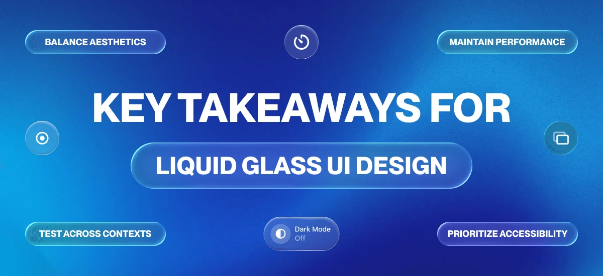
Essential Implementation Guidelines
- Balance aesthetics with functionality: Beautiful design must serve user needs
- Prioritize accessibility: Ensure all users can interact effectively
- Test across contexts: Validate design in various lighting, devices, and scenarios
- Maintain performance: Keep interfaces smooth and responsive
- Evolve gradually: Make changes that respect learned user behaviors
Measuring Design Success
Track These Key Indicators:
- User task completion rates and efficiency
- Error rates and support ticket volume
- User satisfaction and NPS scores
- Engagement metrics (time on task, feature usage)
- Business metrics (conversion, retention, revenue impact)
Conclusion: The Strategic Value of Interface Evolution
Liquid Glass UI design and fluid interface principles represent a fundamental transformation in digital interface design moving from static, one-size-fits-all layouts to adaptive, personalized systems powered by intelligent automation. Successful interface redesigns achieve this by balancing visual innovation with functional enhancements that deliver measurable user value: improved task completion efficiency, reduced friction, enhanced accessibility, and superior performance. As we advance toward spatial computing and AI-driven interfaces, these modern design approaches embody more than aesthetic trends; they reflect strategic shifts in how we create digital experiences that anticipate user needs and adapt seamlessly across contexts and technologies.
The future of interface design is fluid, adaptive, and intelligent, yet it remains grounded in timeless principles of clarity, consistency, accessibility, and user-centricity. By implementing Liquid Glass UI thoughtfully auditing your current design system, prototyping with real users, and measuring results against clear success metrics you’ll create interfaces that serve users effectively while maintaining visual appeal. Great design is never finished; it evolves continuously based on user needs and emerging technological possibilities, ensuring your products remain competitive and valuable in an ever-changing digital landscape.